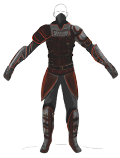
I tried to keep the colour theme the same with the two figures as a set I think they work
Tuesday, 24 November 2015
Monday, 23 November 2015
Monday, 16 November 2015
Digital art good colours
Good colours are a key point when trying to make a picture
Here I found out about adobe.color.com it helps select complementary colours and shades of the colour
This image I found was of a select colour pallet these challenges are good to refine your colour skills Learning how to utilize warm and cool colours will ensure an effective way of contrast
http://juliajm15.deviantart.com
https://www.sebastianvonbuchwald.deviantart.com
The artists above did the challenge simple colours allow you to not get mixed up using thousands of colours in your image
Sunday, 15 November 2015
What are good poses?
When designing characters you would want to get the correct pose as a good pose will visual entice the audience
trying to make the pose as dynamic as it can go
If your having trouble making your own pose use photo reference or http://aomori.deviantart.com/art/Male-poses-chart-148057533
has created many poses like the image below
Sunday, 8 November 2015
Saturday, 7 November 2015
Iteration designs Ranger male
Here I have tried to design clothes for the ranger, having the ranger in lighter leather armor in comparison to the warrior design
I tried changing up the design of normal leather armor by looking how a green highlight will contrast with the color
Hear is a look at how the cape looks on the previous design
a more simple version to show a design without a lot of armor
here I tried to create almost like furs for the ranger
This was a quick look at how other accessories such as the coats or scarfs would look on a ranger
Subscribe to:
Comments (Atom)


